Portal Theme Editor
Customize the look and feel of your customer portal with colors, spacing, and brand elements
Design a customer portal that matches your brand. Customize colors, spacing, and styling with a live visual editor.
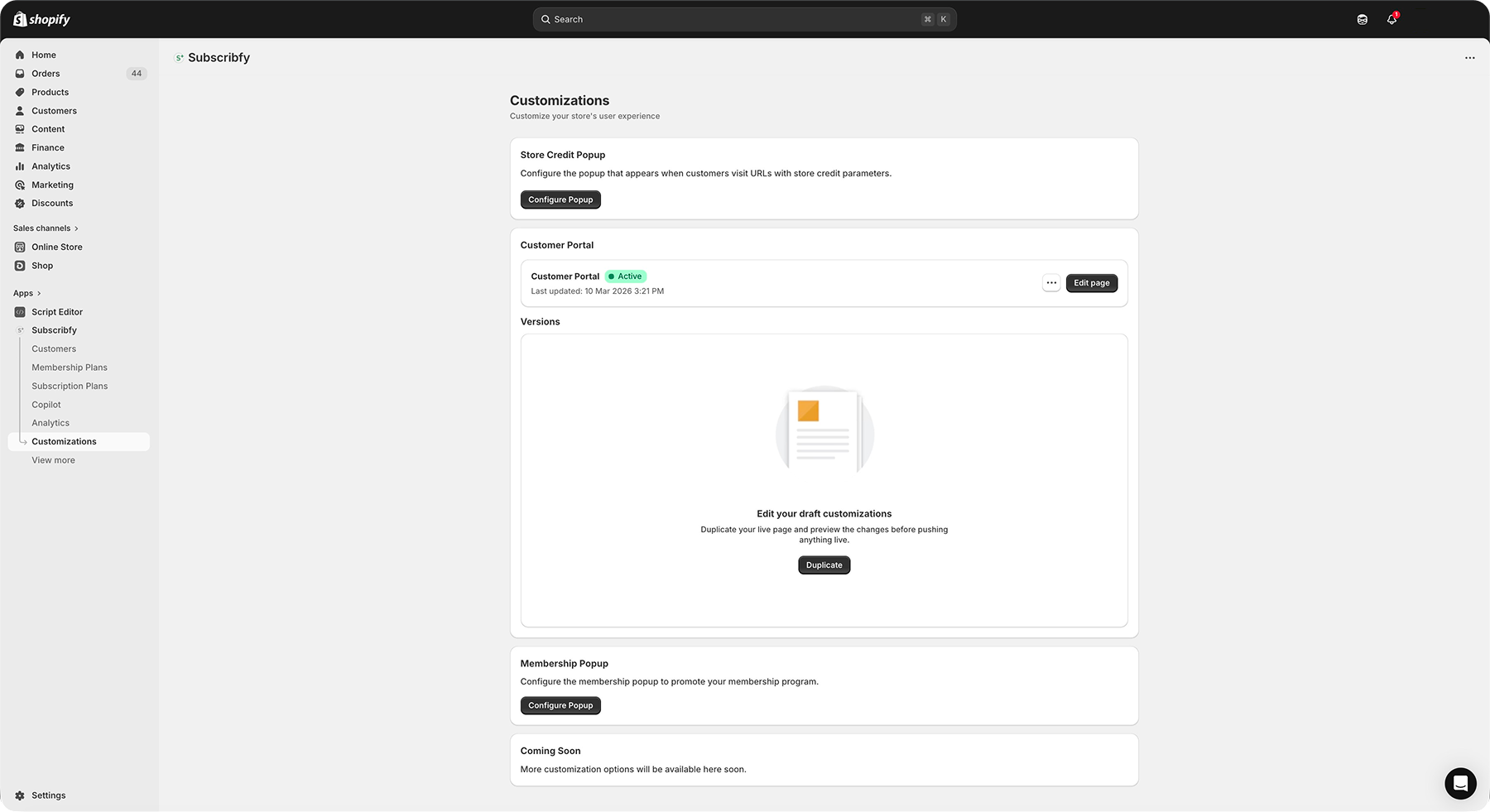
What You'll Get
Brand Colors
Match your store's color scheme exactly
Custom Styling
Adjust border radius and card appearance
Spacing Control
Fine-tune the layout density
Live Preview
See changes instantly before publishing
Quick Setup
Open the Theme Editor
Go to Subscribfy → Customizations → Customer Portal → Edit page.
This opens the visual editor with a live preview of your portal.
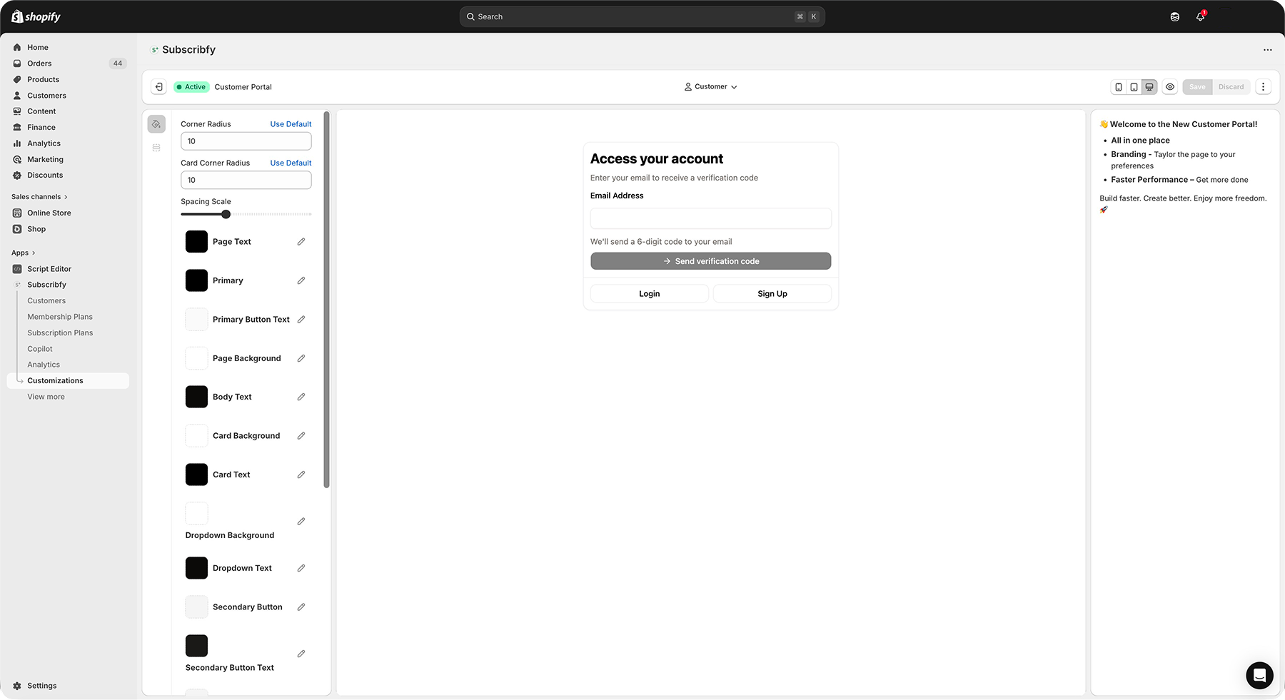
Choose a Customer to Preview
Use the customer selector dropdown to preview how the portal looks with real customer data.
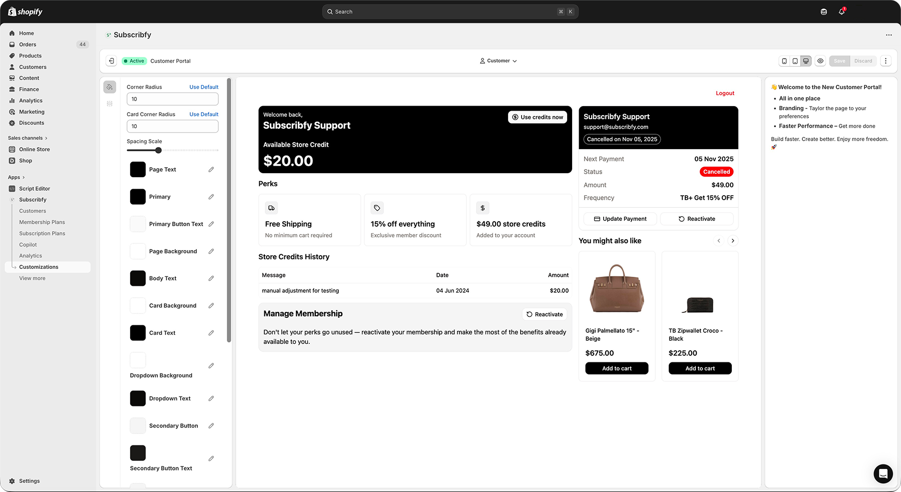
Select a customer with an active membership to see all portal sections.
Customize Theme Variables
Adjust colors and styling in the left sidebar. Changes appear instantly in the preview.
| Variable | What it Controls |
|---|---|
| Primary | Main buttons and links |
| Background | Page background color |
| Card | Content card backgrounds |
| Border | Lines and dividers |
| Radius | Corner roundness |
| Spacing | Gaps between elements |
Save or Publish
- Save - Keep changes as draft
- Publish - Make changes live for all customers
Color Variables
The portal uses the OKLCH color space for accurate, consistent colors across devices.
| Variable | Description | Default |
|---|---|---|
| Primary | Main action color (buttons, links) | Dark brown |
| Primary Foreground | Text on primary buttons | Light cream |
| Secondary | Secondary buttons and accents | Light gray |
| Secondary Foreground | Text on secondary elements | Dark |
| Accent | Highlight and hover states | Light gray |
| Accent Foreground | Text on accent elements | Dark |
| Destructive | Cancel/delete buttons | Red |
| Variable | Description | Default |
|---|---|---|
| Background | Main page background | White |
| Card | Content card backgrounds | White |
| Card Foreground | Text inside cards | Dark |
| Popover | Dropdown/modal backgrounds | White |
| Popover Foreground | Text in popovers | Dark |
| Muted | Subtle backgrounds | Light gray |
| Variable | Description | Default |
|---|---|---|
| Foreground | Main text color | Dark brown |
| Muted Foreground | Secondary/help text | Medium gray |
| Primary Text | Heading text | Black |
Layout Variables
| Variable | Description | Range |
|---|---|---|
| Radius | Global border radius | 0-20px |
| Card Radius | Corner radius for cards | 0-20px |
| Spacing | Multiplier for gaps | 0.5-2x |
Start with radius 10px and spacing 1x. Adjust based on your brand style.
Version Control
The editor supports multiple versions of your portal design.
| Status | Meaning |
|---|---|
| Active | Currently live for customers |
| Draft | Saved but not visible to customers |
Working with Versions
Responsive Preview
Test how your portal looks on different devices using the toolbar icons.
| Icon | Device | Width |
|---|---|---|
| Mobile | Phone | 375px |
| Tablet | iPad | 768px |
| Desktop | Computer | 1200px |
Best Practices
Troubleshooting
Related Features
Customer Portal
Set up customer actions and login options
Custom CSS
Add advanced styling with CSS code
Was this page helpful?